
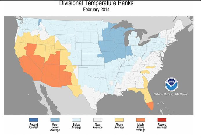
NOAA’s map of February temperatures across the United States got New England all wrong. It wasn’t “near normal,” at all, as the people of the region can well attest. Oh, and the data, too: Hartford, CT, as an example was actually 5.1 degrees below normal.
(Update two: Thanks to Tamino for the correction. Boston’s mean was warmer and Hartford’s colder than I had originally. I have updated the numbers. See bottom of post for first update.)
As the map above shows, NOAA seems to have struggled in creating a temperature map that accurately conveys what New Englanders recently experienced: a frigid February. Hartford was 5.5 degrees below normal for the month; Boston was 2.7 degrees below normal. Providence was 3.5 degrees below normal for the month. And yet all three locations fall within the “near normal” portion of NOAA’s map. What’s up with that?
How well did NOAA do representing February temperatures where you live?
UPDATE: NWS Taunton responded to a query from me about this as follows:
“My guess is that this web site defines near normal for any site with temps + or – 5 degs from climo. Hope this helps.”
I’ve gone back asking that Taunton ask NOAA’s home office for a definition of normal and will update when and if I hear back. The tables below are from the National Weather Service Taunton.
It would be helpful if NOAA and the NWS bureaus were on the same page for the meaning of climatological normal, and if baselines were rationalized. As it stands, the two, though part of one bureaucratic entity, are not on the same page and should expect misperceptions among the public to be the rule until such time as they agree on terms.


You’re right. That map gets a D- (at best) and an outright F (at worst).
Edward R.Tufte would be aghast.
Is NOAA right and all the New Englanders insane?:] Hardly! It was 4 in Bowe, NH, this mornig.
Aww, give NOAA a bit of abreak, Davidg. Imagine that 4 degrees in Bowe as a monthly average. +/- 5 degrees is a mere 125% variation above and below the mean! About right don’tcha think for measuring global temperatures to hundredths of degree accuracy?
the co2ers are totally dependent on the public not checking anything or keeping their own records but trusting the peer reviewed experts and their official data. Even though scientists take no oath ‘to do the right thing’ everyone thinks they have.
Want to do your own checking, jaunty? Check this out.
Carl Johnson:
New Hampshire was cold, snowy and miserable in February. Bearing that in mind, the ski industry is very happy!
I take issue with your language. Weathermen always use the word ‘normal’ when they mean ‘average’. Normal is always a range. Average is a composite number of all temps. Normal might center around the average, it may not. On the flip side of that though, it also means NOAA got it wrong in the other direction. They labeled their chart with references to ‘average’ yet counted the range of +/- 5 deg as if it were ‘normal’.
Pittsburgh -5.4 below average and ranks slightly below normal. Moab, UT -4.5 above average ranks very much above. Cleveland-8 below average, ranks slightly below. What a joke.
I thought within ‘normal’ limits was within 2 Std Dev of the mean. At least that’s what NSIDC seems to use when tracking ice extent. Given that NOAA is guilty of only slightly fudging the data.
Of course, I lived in VA for 20 years and was always surprised when NOAA reported VA temps as ‘above normal’ when I knew for certain it had been a cold summer.
It’s almost like they’re trying to hide something.
I’m surprised no one on this site has read the NOOA site and found that this month they started using new data that drops the pre-1930 data down and raises the current temperatures again. This should be a story of it’s own.
so if +/- 5 degrees leaves us in the normal range why all the anguish of AGW raising temps a degree or two? [Snip — no need to go there.]
If 5 degrees is within range of normal then why such a large area of the SW United States listed as “Much Above Normal” when Flagstaff was +4.8, Winslow was +4.9, Prescott was +4.6, Albuquerque was +3.8, Las Vegas was +4.1, and San Diego was +3.3. The list could go on forever.
I noticed similar trickery in last months (Jan) data from NOAA. The 500mb temp percentile proxy map only includes below average data on the surface data map. Even though the percentile bin is labelled “near average” (white) it actually only includes blue, below average data when compared to the surface data map. My post:
http://planetaryvision.blogspot.com.au/2014/02/blatent-deception-in-noaa-percentiles.html
I don’t know where to find those weather records. You might want to check Burns, Oregon. The map says SE Oregon was warmer than normal. I was there in December on a record cold day. Same thing happened throughout the Great Basin (SE Oregon, central Nevada) that month. Maybe it warmed up?
“Normal” for this purpose is probably judged by reference to records going back to the Little Ice Age.
Quite easily one can follow a well-known standard. For each year in feb, calculate the month average, create a data set of feb averages, (probably close to normally distributed), define the data set to be the last 100 years, and then calculate the standard deviation. Anything within one standard deviation is ‘Near Normal’, outside of 1 stdev but within 2, ‘above/below normal’ etc…
Another trick they did was make the below average color a very light shade of blue, while the above average color is bright yellow. Look at the (lack of) contrast between the light blue “below average” and the white “near average”. They just sort of blend together, which minimizes the visual impact of the large area that they call “below average”. Compare that to the strong contrast between the yellow “above average” and the white “near average”. Similarly, “much below average” is a dull blue color, and “much above average” is bright orange. This is a small thing, but if I am right that it was intentional, it just shows how thorough they were in their effort to present a map that makes the historically cold U. S. winter look as typical as possible.
The relentlessness and scope of the federal full-court press on climate change is disgusting. NASA, NOAA, the EPA, the State Department, the Defense Department, the White House, the Department of Energy, the Agriculture Department, Health and Human Services, Senate Democrats, and many more are part of this concerted effort.
It is also interesting how the temperature gradient colors in many instances follow the state lines.
You’re not making an apples-to-apples comparison.
The NOAA average is against 1981-2010, not against the average of the past 100 years.
Might help to have a look at Tamino’s take on this:
A norm is what something is supposed to be; normal human body temperature is 98.6, and substantial deviation from that temperature is dangerous. Normal eyesight is 20/20, and substantial deviation from that ratio means corrective lenses may be required for driving. There is no normal weather, because we cannot define the norm. There is average weather, which we can derive from past records; but whether that derivation yields what the weather should be is a philosophical question far beyond current knowledge. I reject “normal” as a function of “average.”
Here in Mechanicsville, VA, we are close (12 miles) to the Richmond (RIC) airport, where temperatures are recorded and records are kept. Last summer I started keeping my own records here and comparing them with RIC. While what follows is more indicative of UHI than anything else, it still shows that the map’s characterization of Virginia as “near average” is not strictly accurate throughout the state:
At the airport the monthly average of 39.8 was, indeed, not far from the long-term average of 40.3; but here at home the monthly average was 36.7, or 3.6 degrees below that average. We have lived here 20 years now, and very few February averages have been cooler than that. January was very cold, here more than 7 degrees below the long-term average.
Data recorded at the NWS office in Sterling, Va indicate Northern Va was also colder than normal along with Washington, DC and Maryland.
Dulles Int’l summary: Feb. ’14 “Normal” Difference
Average Max. 41.5 46.4 -4.9
Average Min. 22.9 26.0 -3.1
Mean 32.2 36.2 -4.0
Days Max. < 32 6 1.9 4.1
Days Min. < 32 27 21.1 5.9
Reagan National, DC
Average Max. 45.9 47.1 -1.2
Average Min. 29.8 30.9 -1.1
Mean 37.8 39.0 -1.2
Days Max. < 32 2 1.6 0.4
Days Min. < 32 18 15.7 2.3
BWI (Baltimore)
Average Max. 41.7 44.9 -3.2
Average Min. 24.1 26.6 -2.5
Mean 32.9 35.8 -2.9
Days Max. < 32 6 2.8 3.2
Days Min. < 32 27 21.1 5.9
The clue is in the logo. It says “National Climatic Data Centre”.
A guarantee for getting creatively enhanced data.
Where did you get the charts for the cities? Did you make them yourself?
They were compiled by the National Weather Service – Taunton.
NOAA provides a clear definition of what is meant by near normal, saying:
That means that for the 120 year record from 1895-2014, any division with a temperature ranking between 41st and 80th of those year years is “near normal”.
NOAA also provides a map showing the actual rankings of each division. Using the example of New England, we find that all divisions in New England, except for one in Connecticut (1st division, ranking 36th), have rankings between 42nd and 70th. They are, therefore, correctly classified by NOAA.
It is an apples to oranges comparison to look at anomalies when trying to rebut claims about rankings. The two will only be approximately related, and can be seen by comparing the map of anomalies to that of rankings from NOAA. It is, at best, astounding laziness to base a post on such an invalid comparison rather than actually comparing rankings. That laziness compounds to outright incompetence (at best) when you do not notice the anomaly you are using is for the 1981-2010 rather than the actual comparison period used in the rankings (1895-2014). (Note: Tamino uses the 1901-2000, the default period for anomalies in map linked above. That is still inaccurate for comparison, but far less so than the period used by Ambler.) For what it is worth, I have only verified the ranking of one New England division (Massachusetts Coastal, ie, the division including Boston)
The compounded errors of Ambler are bad enough. That superficial readings of Ambler are then used to justify vilification of NOAA and its employees shows much about the integrity of those making the accusations, and nothing about that of NOAA. Clearly they would rather vilify on the on checked word of a random blogger than actually check the facts, uncomfortable as those facts are to their world view.
I’ve updated the post. The mistake, arguably, originates with the NWS and NOAA, its parent, not being on the same page. Arguing that 3 to 5 degrees below climatology should be represented on a map as “near normal” is a weak argument. Again, this originates with NOAA and NWS.
The ranking is normal with respect to the entire NOAA dataset, starting in 1895. A ranking for the last 30 years would not make very much sense, would it? The climatology you refer to is from NWS and hence (like other normals from weather services, see WMO) currently the 1981 to 2010 period. This tells you that the average of the last thirty years is about 3 to 5 degrees warmer than what was normal for the 20th century.
I am surprised, that after 5 years of blogging on climate change the issue of different baselines seems to be new to you.
Yes, it *would* be nice if everyone used the same baseline, but the data groups do not (GISS, HadCRUT, UAH, RSS, NOAA, etc.) That’s makes it vital to check baselines every time, before presenting results and certainly before making accusations about who’s wrong and who’s being misleading. .
Common sense applies on a few levels. One, the NWS and NOAA should not publish products that give dramatically different senses of the same event, such as February 2014 temperatures. Two, New England did not have a “near normal” winter, no matter how you might want to dance around the fact. If, as a reporter, you want to communicate that New England’s winter was “near normal,” then you would do well to look at your own reporting skills. Three, bringing in GISS, HadCRUT, and the rest is a straw man argument. Let’s focus on the job that NOAA’s map of February 2014 temperature did at conveying what happened around the country, shall we?
“New England did not have a “near normal” winter”
please, compared to what reference? The previous two years? The last thirty years? The 20th century?
There is a rich irony here. It evidently has been a nearly normal winter, at least based on average temperature relative to a long baseline. The only thing that doesn’t make it seem like a nearly normal winter is the long-term warming trend at New England.
Again: NWS published data indicating a very cold New England February. My post, above all, asks that NWS and NOAA get on the same page with their definitions of “near normal.” If you lived in the region, which you presumably do not, you might be arguing less stridently about how “normal” February was.
Well, NWS is part of NOAA. Nevertheless, of all the examples of a federal agency’s right hand not knowing what its left hand is doing, certainly this has to be one of the most minor. You are right, I do not live in New England. But I’m also betting that you were not living there during the entirety of the 20th century, which is the baseline upon which “normal” is defined in the graph you reproduce at the top of this post. So, as a relatively recent (climatologically speaking) transplant to New England it doesn’t SEEM normal to you. But according to NOAA NCDC it evidently is not terribly far from the 20th century mean.
I was the chief meteorologist for a tv station for 11 years and made my own graphics the entire time. While I can’t read the mind of the person(s) that created this graphic, I can relate to the likely intent of communicating, with use of a graphic to send a message to the viewer.
On tv, the color bands are only on the screen for mere seconds and project almost the entire message. Likewise, on this map, the colors provide a powerful message that the majority of people viewing it will use to interpret the meaning…………………….which undoubtedly, is that it wasn’t that cold compared to normal in many places of the country as what the real world empricial data clearly shows.
This would be speculating but I imagine that if you didn’t live in the locations underrepresented by colors to reflect actual cold, you would think it must not have been that cold.
If you did live in those areas, you “might” think that maybe it just seemed colder than what occurred.
If you have half a brain and have lived in those areas for a few decades, you know something isn’t right with that map.
If you have a full brain, trained in science, you KNOW the map is bogus and strongly suspect the reason why.
It has been ~5 degrees below average the last few days in Seattle. But we’ve seen a bit more sun (strictly subjective), so I’m ok with it.
What this signifies, I have no idea, other than it’s been a bit colder than one might expect.
Ashville, NC…. ( +0.1 “Above Normal” )
Hartford, CT…. ( – 5.0 “Near Normal” )
Gotta love it
When a posting contains such a basic error as this one, we should not have to wade into the deep comments to find an admission of the mistake and an explanation (or, in this case, an excuse) of how it arose.
You owe it to your readers to either withdraw the post entirely, or re-write with the corrections in place. Or LINK TO (not just mention) Tamino’s post.
Keith Pickering: We disagree.
“Normal” weather has conventionally been defined as averages over a 30 year period for many decades, long before the “Johnny come lately” NOAA. I, for one, appreciate Harold Ambler’s public service contribution in calling attention to the absurd NOAA chart.
NCDC historical data are thoroughly manipulated and, in my opinion, of little consequence to anyone for anything other than their intended purpose — to support the near bankrupt anthropogenic global warming thesis and continuing public funding of well paid bureaucracies and research grants.
Harold Ambler,
The NOAA web site provides a map with monthly deviations from the 1901 to 2000 mean for that same month. Much more clear and better information than the map you show. You may not like the NOAA map classifications for normal, below normal, etc. (I don’t find them very useful), but they were very clear in describing what those classifications were based on, so I am not sure what you are criticizing. The map of calculated monthly deviations is on the exact same page, and IMO, it is very clear. I suggest you be a little more circumspect before posting highly critical remarks about a pretty good website.
Why do the CAGW folks always pick the late 1800’s to compare todays temperatures?
Unfortunately many of us know that this was the end of the coldest period in recent history and it will distort the reality of temperature rise for the uninformed. It is cherry picking the starting point. I may have missed it but I did not see that the period over which the average was established on the NOAA chart started in the late 1800, when people were practically starving. A responsible, honest scientist would have provided that information especially for those believe everything NOAA publish .
No surprise here NOAA and the CAGW folks want to deceive. Living in NJ, I saw numerous bodies of water frozen over which is rare (except for circa 1895) yet most of NJ is near average. What a joke for anyone who lives in NJ and experienced a brutal winter!! NOAA claims it was average.